|
I chose this specific tweet because I remember watching all of this transpire when she tweeted the picture of the prom dress. I remember having incredibly strong feelings toward the situation, so I wanted to look back on this scenario through the lens of “So You’ve Been Publicly Shamed.” I also found it interesting because this occurred just five years after Justin Sacco’s demise, however, twitter seemed to be arguing more with themselves than the transgressor in this instance. The tweet seemed innocent upon first glance. Most girls in high school post prom pictures as a way to show off their friends, their date, and their dress. In that intended context, this tweet blends in. These tweets tend to only be viewed by fellow high schoolers, and I think that leads to massive misunderstanding. Twitter has become a beast that can spread what was once intended only for friends to the entire world. This is a lesson I think many are still learning. I have no doubt in my mind that this girl had no malicious intent, however, she did not think through her entire audience when she posted her prom pictures. Her purpose was to solely show off her dress because she thought she was doing so in a respectful manner to Asian culture. The biggest problem with this scenario is that even when she was told that was she had done was offensive, she refused to take down the post or apologize for it. A twitter user responded with a lengthy explanation of the history of the dress she wore, and why it was incredibly offensive and appropriating for her to have worn it as a prom dress. He even compared it to “colonial ideology.” After reading the insanely harsh comments that Justin Sacco, Mike Daisey, and Adria Richards received, his response seemed quite tepid. He shot down the misunderstanding more than the teen herself. Restoring communication and understanding to this issue would be easier if those involved had a more open mind. I think there is something to be said about the fact that she decided to wear the dress out of respect and admiration for the culture. She was obviously not educated on its importance and the impact this would have on those in the culture. Likewise, she needs to understand not only that this dress was indeed appropriated, but also that an apology is in order. Her lack of apology almost made me think about all of the case studies we read in which careers and lives were entirely torn apart by single comments. Every single person we read about had no problem apologizing for their part in the misunderstanding, and this made me wonder about whether or not the internet was harsh enough on her. Even though people were frustrated with her ignorance, her name wasn’t rolling out of everyone’s mouths like Justin Sacco or Jonah Lehrer. She had an easy out by removing the post and apologizing for the role she played in any misunderstanding. Because she didn’t do this, I think this chapter in her life will remain open. 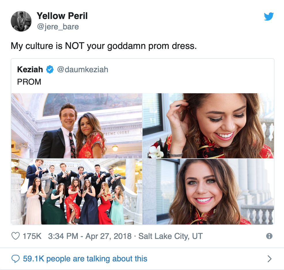
1 Comment
I decided to create a logo that had an almost “medieval” look to it. I thought this went along well with the themes of the play, and I decided to include the iconic skull in the hand. I think this is easily recognizable and definitely a main element of Hamlet. I decided to align the title around the skull almost to create a crown-like effect on the skull. I thought this went along nicely with the “Prince of Denmark” idea. I also changed the color of “Hamlet” to red because most everyone is dead by the end of the play, so I thought it matched that quite well. The layout of the home webpage was a little more tricky. I wanted to make sure to keep it simple so as not to immediately give the impression that students designed it. I added the yellow scrolls on the side to best utilize the horizontal space. I noticed that my least favorite part of other websites is not using the side panels as space and instead making it a more vertical website in terms of alignment. I almost want each page to be completely visible without the use of excess scrolling, because I think that’s what gives an overwhelming effect. I also added three pictures at the bottom of the page that would act as slideshows. I think specific pictures can be used on each separate page depending on whatever we’re talking about, but I thought that would be a good way to insure that we were using all assets provided. I think this layout could be used on each individual page with an added textbox under the navigation bar. I also noticed some of the other websites didn’t include a “home” button in the navigation bar, and I think that’s important to keep a consistent looking website for those visiting possibly globally. 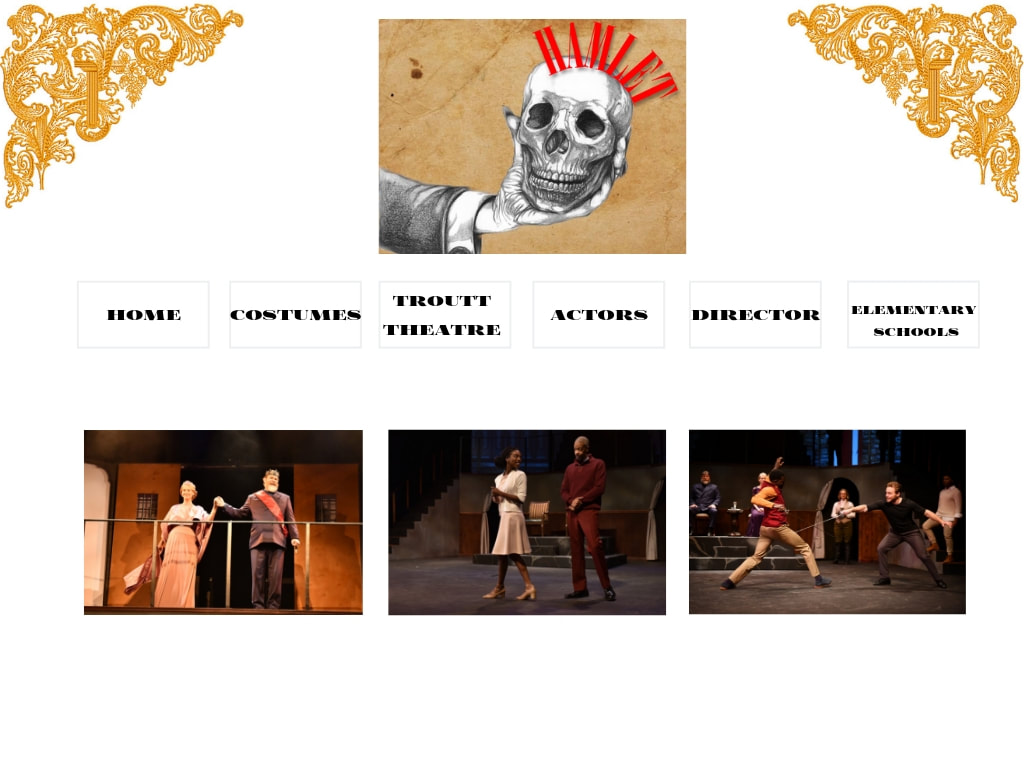 I created this site from scratch, and I find that to be quite obvious when you look at it. I initially used a template I had found online, but it also came with about seven different stylesheets. I had multiple problems when trying to combine them together or even just move around a few lines. The entire site would switch up, I would sigh, and then I would change the code back. The template gave the site high potential, but it ended up being too much to handle. I then started over from scratch and utilized the tutorial we did in class to help guide the general layout I wanted. I found adding code easier than figuring out which code to take away from a template. This strategy helped me get the website to where I wanted it to be.
I initially wanted a super interactive website while still maintaining a generally minimalist overview. I was not able to achieve the interactive part without dedicating days to this process, and I wish I would have been able to do so. However, I’m not entirely disappointed with how the website came out. I knew my limited knowledge of code would have to drive the website design instead of my vast dreams for an interactive layout. If I knew everything about code, this website would be a little more fun to navigate and also probably represent more aspects of my life. I would hope it would still maintain a minimalist appearance with emphasis on pictures. I think the lack of linguistic mode is most prevalent on this site. It was initially an accident when I deleted one too many lines on my home page. However, I then became a little intrigued by the idea of a site entirely based on visuals instead of verbal guidance. I used mostly visual aids in the form of my film pictures and favorite albums. I thought this represented myself more than writing out my favorite songs or hobbies. I did add an embedded Spotify link to represent the aural side of communication. These two modes work together to perfectly present a minimal, yet effective, overview of myself. When it comes to design strategies, I found myself focusing most on audience and color. The audience was important for me because with even the slightest change, it has the potential to completely change everything about my website. I assumed mostly Belmont students would be looking at this page. With that knowledge, I made the assumption that a Belmont student most likely appreciates and understands the artsier parts of life. This knowledge allowed me to add the visuals and Spotify link knowing that my audience would at least somewhat understand it. I also found color to be incredibly important. Most of my film pictures are warm in tone, so I really wanted to have a cool toned background for contrast. I also purposefully aligned everything in the center to draw the maximum amount of attention to the photos. I knew these tactics would achieve my goals, and I also knew how to code them.
I was highly impressed looking through the Shakespeare archive from the Massachusetts Institute of Technology. The website is visually pleasing and easy to navigate. The setup also doesn’t just seem welcoming, but it almost seems to urge you to click through the moving links and discover more. The audience for this archive would be anyone looking for Shakespeare performances or even information and reviews on those performances. The tone for this audience isn’t exactly formal, but it’s scholarly in a way. The purpose of this archive isn’t too hard to figure out, because they have a useful “about the archive” page. Their goal is to share the different cultural forms that Shakespeare works have taken on around the globe. The sole purpose is to educate and engage those seeking to learn more about Shakespeare around the world. The context of this website is setup in a very logical way. I chose this archive in particular because the archived videos were on the home page, and I appreciated the layout of that. Each video is from a different culture, and some videos are even in another language. This archive provides ample information on each video, and I find that fascinating. They seem to cover most cultures evenly, and I think that’s important. They seem to give emphasis to the videos themselves. They are on the front page, and they are set up in a way to invite you to open one immediately upon visiting the archive. They have essays and articles written about Shakespeare around the world by scholars and students alike, but it seems as though this part of the archive is more of an afterthought. The information is there if someone needs it, but they would have to know what they’re searching for.
I really appreciated the almost minimalist approach this archive took. Although there is a lot happening on the page, the important parts are easy to identify and it doesn’t take but a few minutes to figure out your way around the site. I think ease of user engagement is incredibly important if we want anyone to pay attention to our archive over one that’s maybe a bit less crowded or more easily identifiable. I also think an “about” page is super helpful. If I wasn’t in this class and didn’t have someone to explain it to me, I probably wouldn’t exactly know what a “Shakespeare archive” referred to, so I’m assuming most other people don’t know as well. The about page would provide information about where the archives are coming from and our purpose for creating the archive. I think this information will help our audience gain the most out of viewing the archive. I also appreciated how diverse the archive material was. It seems like they really want people to see just how imbedded Shakespeare is into most theatrical cultures. The diverse videos provide a perfect archive of information that includes everyone. I think our biggest issue to avoid is over-cluttering that potentially could lead to misunderstanding of our archive. 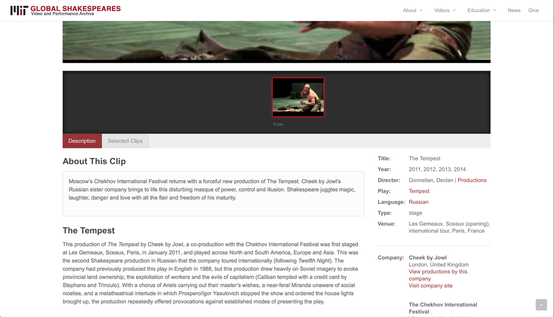
https://globalshakespeares.mit.edu
Out of all the archiving technologies available, I find myself focusing on Spotify, Instagram, and Twitter. I dabble in other social medias, but I find myself most concerned about branding when it comes to these three. There is a fine line between trying to appear transparent to the world to better your career path and oversharing in the form of borderline offensive statements or images. I think this idea is reflected in how I use online archiving technologies. Spotify is my favorite platform to portray what I want the world to see and hear. I am uncommonly odd about what I allow to be viewed on my Spotify. Because music has been the cornerstone of my life, I find this to be the most influential in my day-to-day life. Sounds play a massive part in what I want to do with my life, and I think that’s why I value streaming platforms so much. I have quite a few playlists that I hold a little too close to share, so they are on private viewing. I believe a life can be fully illustrated with just a few playlists, so I try to let that ideology shine through on my Spotify. Instagram comes as a close second to Spotify. In my head, the two coincide perfectly to show the world the brand I try to illustrate. I post videos of songs I have written as a fun way to keep people updated on what I’m doing musically, and I find it is also a good way to timestamp my life whenever I scroll through my profile later. Lately I have been mainly posting pictures that I take with my film camera. The entire process of film photography brings me so much joy, and I like that to shine through in what I post. I keep my Instagram incredibly clean in terms of obscene language or general inappropriate behavior. I recognize that an Instagram profile could be the difference between getting a job or not. I mainly utilize Instagram as a visual way to represent the things I see in my own life. Twitter is my least favorite of the archiving technologies, but I also think it’s one of the more accurate ways to archive ideas. I used Twitter mostly in high school. I found it to be the only resource where I could stay up-to-date on memes and politics equally. I enjoyed the social circle feeling of it because you really only follow a few celebrities alongside all of your friends. I was a bit less careful of what I posted on Twitter in terms of letting my sarcasm and true thoughts shine through. I have since made my account private because you just never know what can come back to hurt you later. In general, I mainly use archiving technologies that won’t be able to offend people in the future and hurt my chances of getting an internship or a job. I place a lot of importance in brand imaging, and I think that all begins at the social media level. 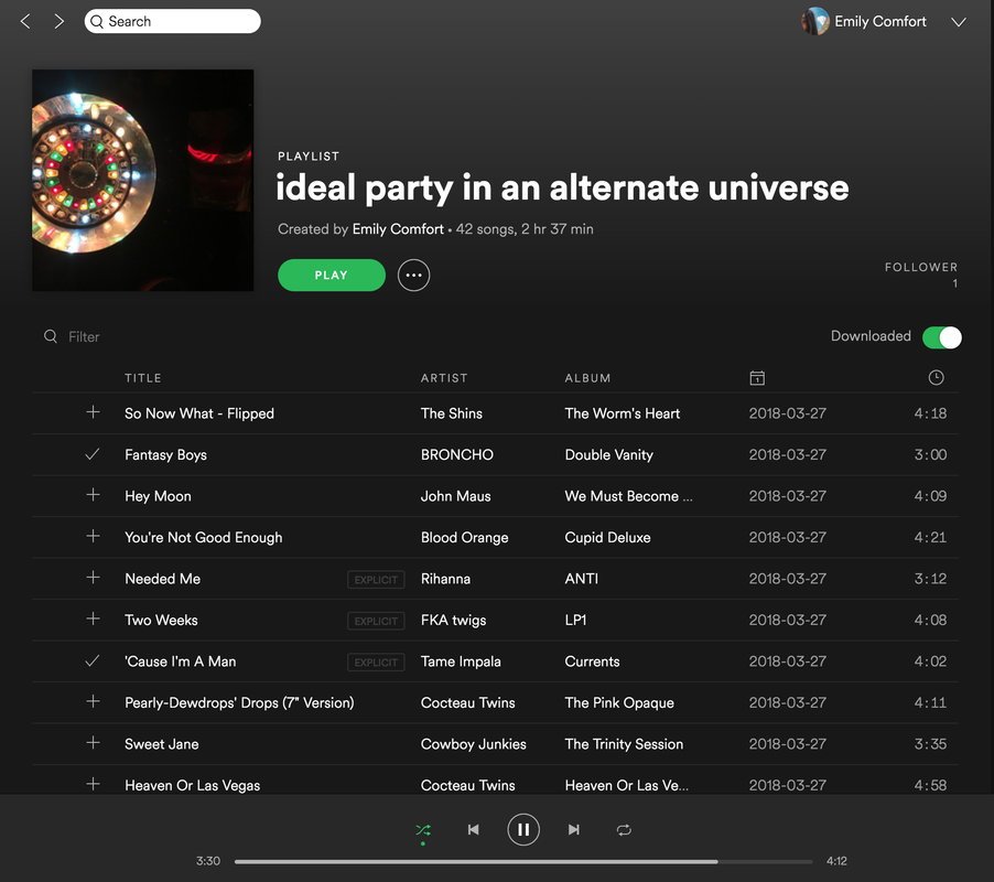 |